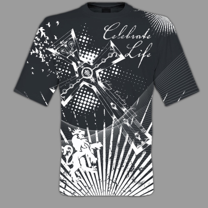
Im starting a new Tshirt Design to submit to the Nazarene District church, or something to that effect. Turns out someone liked the design for the startup church from a couple of years ago. I really enjoyed doing that project since it was an oversized printing process where the entire front area / surface was covered. It was a single color and it still came out pretty well by my standards. Of course I always see room for improvements in composition. But as far as the final product I respect the process and I can move on.
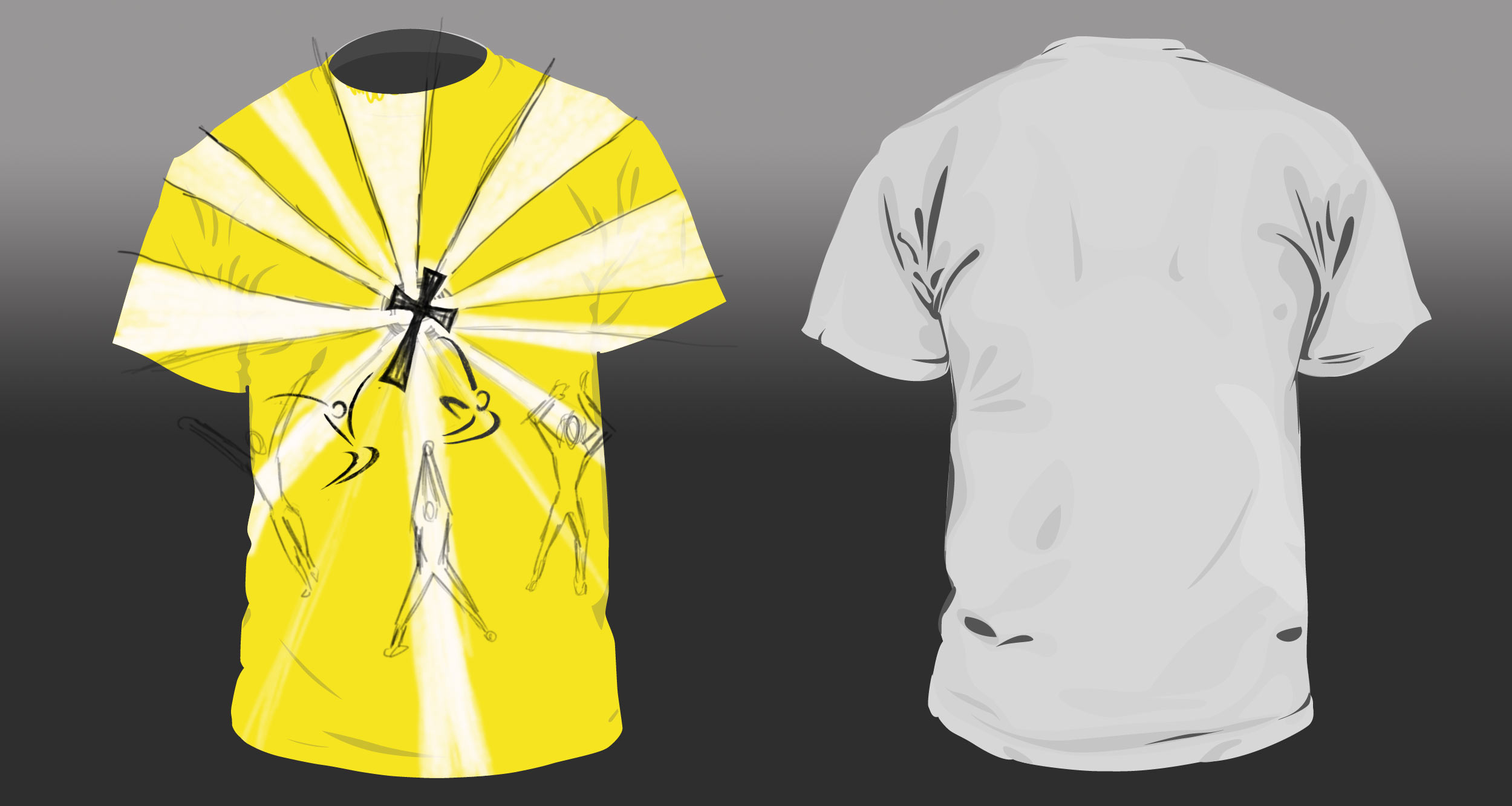
This latest design, or sketch at this point some what similar. I’d like to take it further by possibly overlaying another color and foil if print in some areas. But first we have to agree on a vision. I think I am interpreting the ideas being presented to me well. We shall see.


